“If Nancy doesn’t wake up screaming she won’t wake up at all.”
That's the tagline at the top of A Nightmare on Elm Street's 1984 one-sheet poster. Below it, we see Heather Langenkamp's Nancy Thompson in bed with her eyes wide open, brown hair splayed across her white pillow. Above her, Freddy Krueger's iconic leather glove boasting razor sharp knives mounted on its fingers. Instead of Krueger's burned face behind the knives, we see a skull with human eyes.
Just as an image, the poster goes hard. But, with that tagline, New Line Cinema perfectly encapsulated the terror at the heart of Wes Craven's paranormal slasher. It's the rare tagline that makes me reconsider whether marketing for art can actually be art, in and of itself.
That tagline is just a killer, poetic turn of phrase. It can be difficult to explain why a sentence works or doesn't. Sure, there are rules and grammar to obey (or skillfully disregard), but understanding the rules doesn't make you a great writer anymore than knowing how to dribble makes you Michael Jordan. Sometimes a sentence just has the juice, that special sauce that makes it instantly iconic. But, I'm gonna attempt to analyze why it works so well, anyway.
The tagline is perfect because it gestures at the core conceit of the movie without giving anything away. From it, we understand that Nancy is the heroine and that there's something that wants to kill her while she's asleep. Then, it takes something we traditionally see as frightening — a nightmare waking us up — and makes it the solution to Nancy's horror, rather than the horror itself. Something we fear in everyday life, is now the more desirable of two options. That suggests that whatever the horror of the movie is, it's scarier than any bad dream.
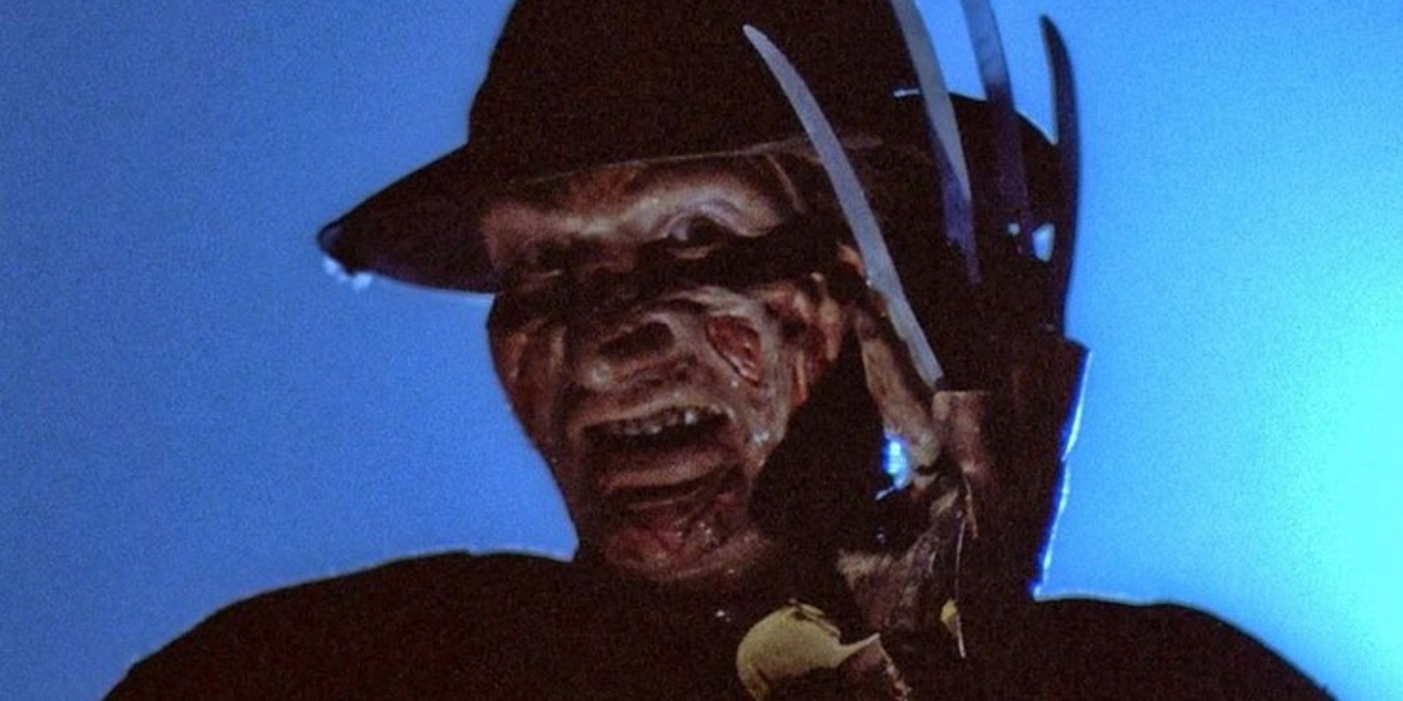
The best taglines work in concert with the poster and trailers and TV spots (and now, in the digital age, with tweets and Facebook posts and the ads that play before YouTube videos) to make you feel that you need to see the movie they're advertising. You read them and think, "Well, I gotta see that for myself." In this case, the poster effectively complements the tagline, by obscuring Freddy Kruger from us. We get to see the iconic knife glove, glinting in the light, but the killer who will wield it in the film is, instead, represented by a skull — death itself.
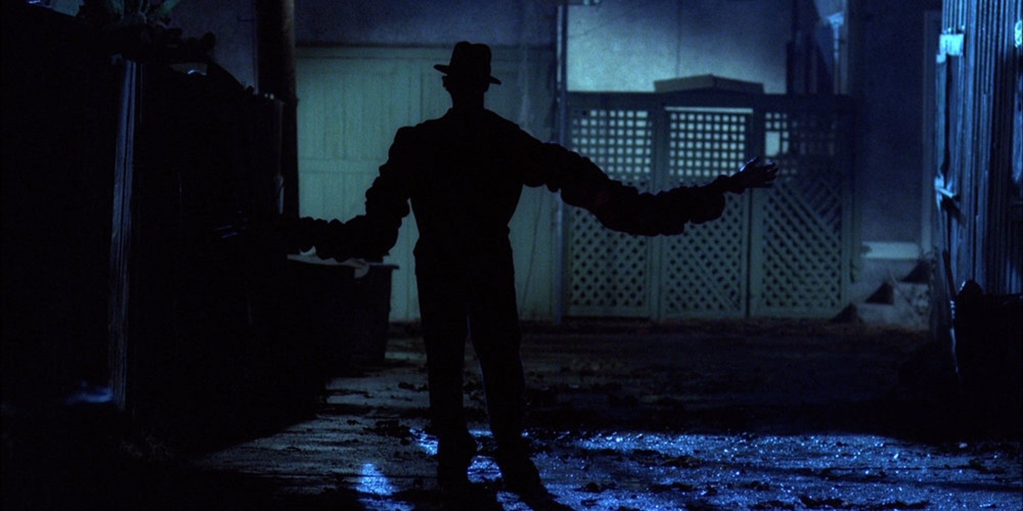
As a result, the poster sets us up with compelling questions — who is the killer in Nancy's dream? how would they kill Nancy in her dream? why can't they get to her in real life? — but positions the movie as the only place you can go for the answers. It produces an itch in our brain that buying a ticket is the only way to scratch. The theatrical trailer gives away more, showing glimpses of Freddy Kruger, but we still mostly see him in parts — his knives, his eyes, his silhouette as his arms stretch out from his body. Instead of focusing on Krueger, the trailer devotes significantly more time to his visible impact on the real world through Craven's brilliant use of practical effects: Tina getting lifted through the air and onto the ceiling, a tongue extending from Nancy's phone, Nancy getting dragged beneath the water of her bathtub.
The marketing team behind this movie had the good sense to know that when you try to explain a dream, something gets lost in translation. We have to see Nancy's nightmare for ourselves.
Source: Read Full Article

