This fall I'm replaying the entire Half-Life series. I'm not sure why: it just feels like the right season for it. Maybe it's all the orange. But I wondered: which version of the original Half-Life should I play? There's Valve-blessed fan remake Black Mesa, which is very good, but not really the same game. There's Half-Life: Source, which improves a lot, but strays a little too far from the original for my tastes. So I settled on the OG release, with no HD models or other enhancements. I wanted to play Half-Life exactly as it was when it launched in 1998.
I'm glad to report that it's still great. It's not just a game people remember as being a classic: it straight-up is. Gordon Freeman's battle through Black Mesa, fighting grenade-slinging marines and weird aliens, is every bit as thrilling as it was almost 25 years ago. The game's deft mix of first-person shooting, hazardous environmental puzzling, and hands-off storytelling feels remarkably fresh in 2022. But I wanted to take things a step further than simply playing the original version of the game—which, incidentally, is still on Steam and works without any headaches on Windows 11. Valve has always been good at preservation.
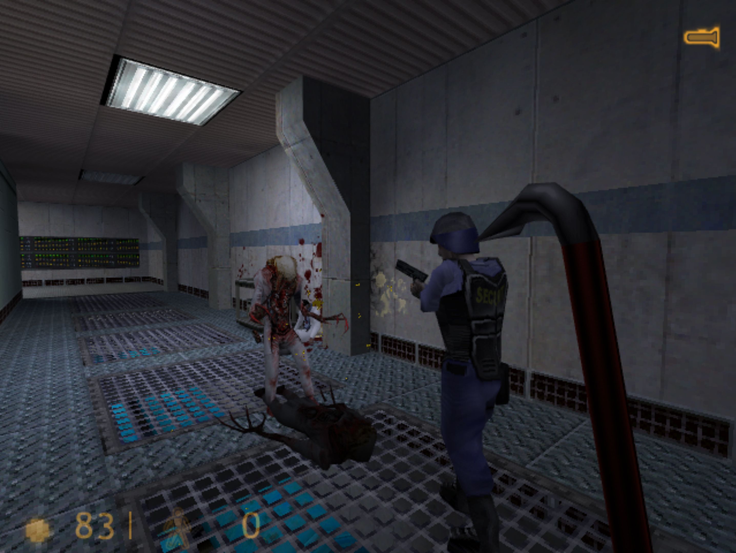
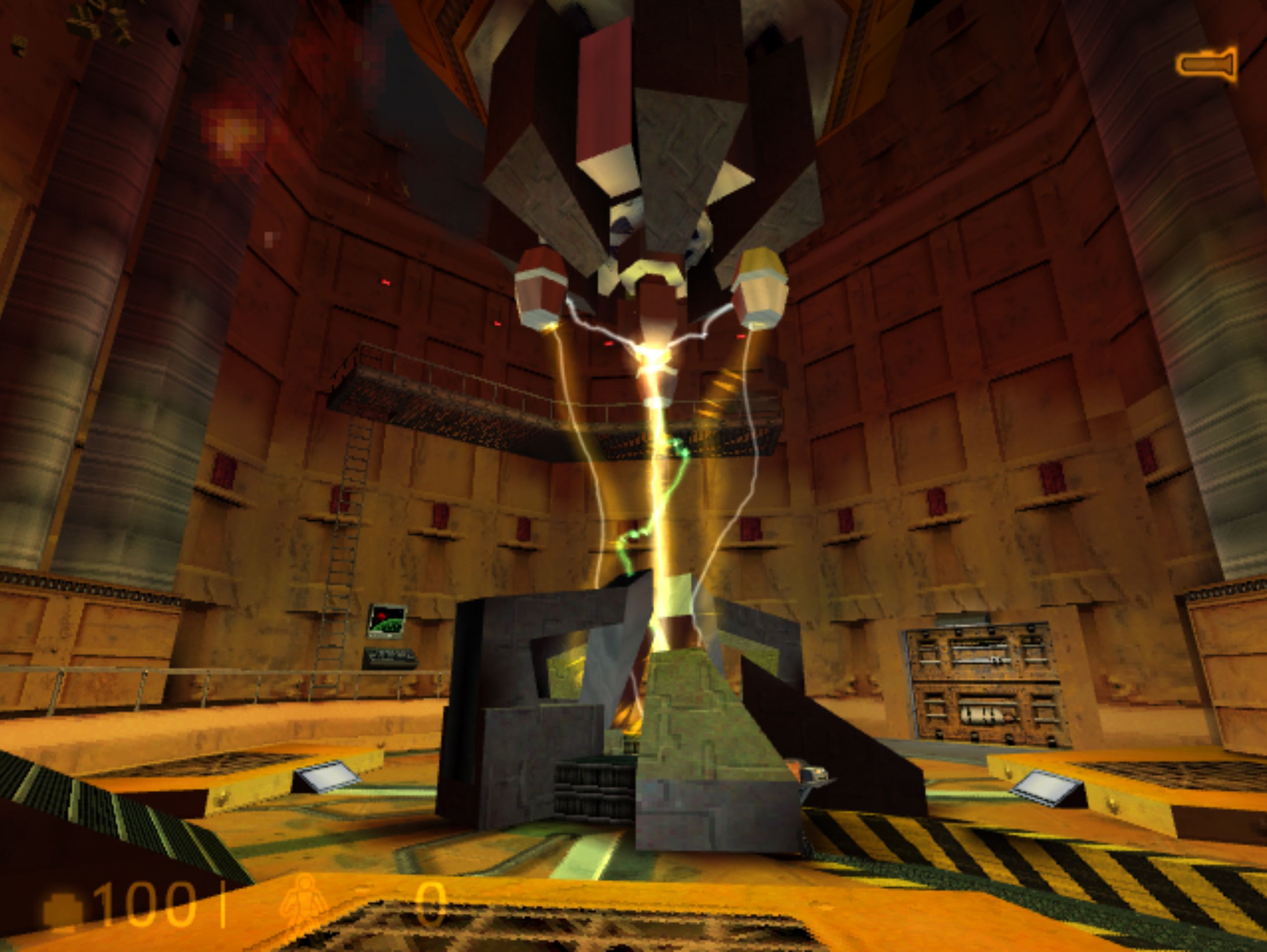
Out of habit, I immediately set the resolution to 3840×2160 and started playing the game in 4K. But it felt wrong. Not only was the UI (which won't scale without replacing a bunch of files) stupidly tiny, but it's clear this game was never intended to be played at such a high resolution. When Valve's artists designed Black Mesa, they didn't think people would be looking at it on a fancy 32-inch UHD monitor. They probably didn't even think people would still be playing it at all in 2022. So I lowered the resolution to 640×480—which is what I played most PC games at on my old Pentium II back in the late '90s—and voila. Perfection.
This is what Half-Life is supposed to look like. As a PC gamer you get hung up on trying to squeeze every last pixel out of your GPU, so there was something liberating about going backwards. Better still, it's in 4:3—which I've always considered to be God's aspect ratio. The old-fashioned square frame has experienced something of a comeback in the arthouse film world, with the likes of The Lighthouse, Bait, The Grand Budapest Hotel, and Fish Tank all eschewing the contemporary widescreen standard. Our medium is still playing catch-up here, but the beauty of PC gaming is that you can force most games into 4:3.
Half-Life just looks better in a square frame. I'm sure there's an element of nostalgia at play here, because it's how I first experienced it back in '98. But it's also what ratio the developers at Valve would have designed, built, and playtested the game at, so you're getting the precise experience they intended. The low resolution, rather than making the game look 'worse', brings it closer to the original vision. Smothered in a layer of pixels, the textures and 3D models come to life—especially if you use a console command to disable texture filtering for that accurately crisp period look. It's ancient, but it's still beautiful.
Remasters, remakes, and re-releases of '90s games tend to jack the resolution all the way up, which I get, because it makes them look nicer on modern TVs. But for me, something is always lost in the process. A game ceases to look like itself when you radically increase its pixel count. To be fair, some developers do get this. Sega's superb Shenmue remasters offer the option to play at the original Dreamcast resolution, at that wondrous 4:3 aspect ratio—and I always do, because that's what Shenmue was always meant to look like. It's time to fully embrace the crunchy low-res aesthetic, 'cause a clean image is a boring one.
Source: Read Full Article

