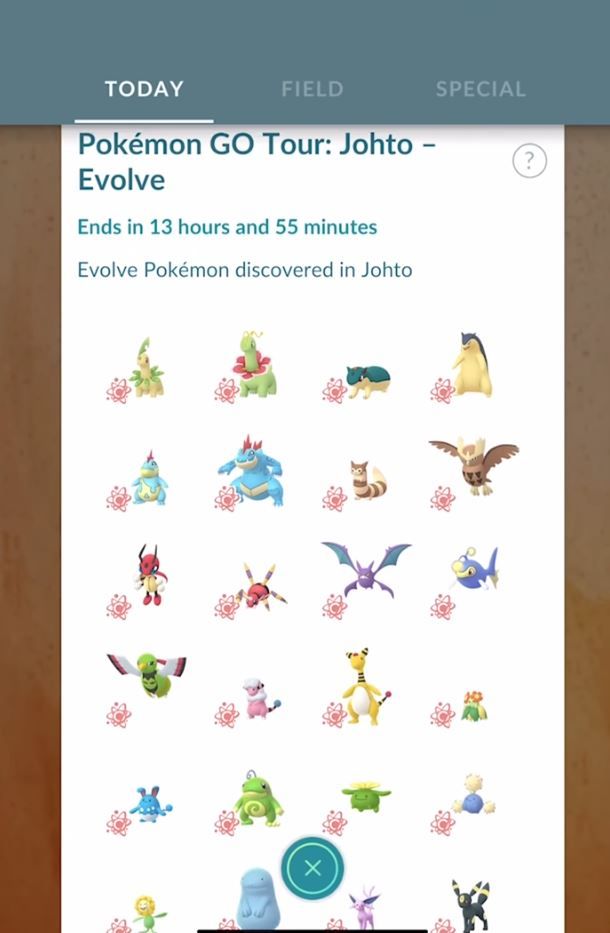
Last weekend’s Johto Tour event in Pokemon Go was kind of a nightmare for me. Keeping track of research tasks across three different pages, managing incubators, keep on top of buff timers, chasing down worthwhile raids, searching for Gym leaders, sending and receiving gifts, managing item bag and Pokemon storage space, feeding my buddy, trying to sync up my tasks with my partners – it was all too much to handle. I spent more time standing still, just trying to get a handle on all of the information that was being thrown at me, than I did actually walking around catching Pokemon. I loved the variety and excitement that the event offered, but it highlighted just how bloated and unwieldy Pokemon Go has become. The game needs a major overhaul to its user experience on the level of a full sequel. Pokemon Go 2.0, if you will.
The UI has reached critical mass. Scrolling through lists of Special Research Assignments, Field Research, and event tasks spread across three different pages – each with multiple quest steps – is overwhelming and difficult to keep track of, especially during a limited-time event. When time is a factor, I want to make sure I’m maximizing by doing multiple tasks at once, but remembering to take pictures of five wild Ground-type, power up three Pokemon, and defeat Team Rocket three times. There’s just way too many tasks to keep track of, especially during events, and no good way to do it. We need a way to pin tasks to the screen so we don’t have to constantly swipe through menus to remind ourselves what to do next.
Another thing that constantly slows me down is micromanaging my storage. While Pokemon sorting has improved somewhat, it’s still incredibly difficult and time-consuming to organize and prioritize Pokemon and items. It doesn’t matter if you have 50 slots or 500, you’re going to fill up your bags no matter what, and these systems still need a lot of attention. The Appraisal function is just a pointless time sink that dramatically slows down our ability to catch and transfer Pokemon. We need to be able to see the stats immediately so we can decide which Pokemon to keep and which ones to transfer as soon as we catch them. I’d also like a picture-in-picture of my highest-stat Pokemon of the same species so I can instantly compare them. At the very least, we should be able to see the stats of our favorited Pokemon whenever we catch a new one.
Then there’s the management issue. Suppose you want to just catch 50 Pokemon and release them all at once later. The mass release tool and filtering options help that process, but it still becomes a massively time consuming task if you care at all about persevering your high-stat Pokemon. Filtering by duplicate Pokemon would help, as would filtering by high-stat rather than just CP. We need a lot more customization and control over our Pokemon storage now that we have hundreds and hundreds to manage. Items are even worse, and I’d love to see an auto-delete that tosses out items I’m never going to use, like basic Poke Balls and potions.
There’s a lot of quality-of-life changes that Pokemon Go needs if it's going to continue expanding, but there are also some necessary changes that updates may never be able to fix. The battle and raid mechanics are as shallow and frustrating as they’ve ever been. Nearby Pokemon tracking is still horribly inconsistent and imprecise when it ought to be a core feature of the app. While playing the event with my partner, we invariably will have completely different Pokemon on our screens and completely different trainers in our Pokestops. We didn’t get to share in the excitement of tracking down a rare spawn and catching it together, which used to be the best part of Pokemon Go.
There will never be a Pokemon Go 2 because that’s just not how live service mobile games work, but the game needs a major overhaul to its user experience. I want it to keep growing and I enjoy how much variety there is and how many challenges there are to pursue all the time, but the app is being crushed under the weight of all its features.
Source: Read Full Article
