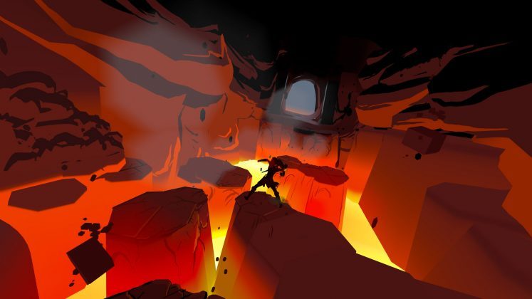
Perhaps no project to date shows the potential of Quill—Oculus’ VR illustration and animation tool—quite like The Remedy. Created by veteran animator Daniel Martin Peixe, The Remedy is a roughly 10 minute long story which establishes a very effective comic book-like experience by stringing together various Quill scenes to tell a complete narrative. Peixie shared with us a glimpse inside of the production process which brought the film to life.
Guest Article by Daniel Martin Peixe
Daniel Martin Peixe is a character animator and illustrator at Walt Disney Animation Studios. With twenty years of experience in 2D and CGI animation, his recent work can be seen in critically-acclaimed films like Tangled (2010), Zootopia (2016), and Moana (2016). Peixe has been a mentor for the professional online animation workshop Animsquad since 2017. He is the writer, director, and creator of the VR short film The Remedy (2019), created entirely within the Quill VR illustration tool.
How to Watch The Remedy
If you haven’t had a chance to watch ‘The Remedy’, we recommend doing so for context. The short is available in Quill Theater on Oculus Quest, here’s how to find it:
- Ensure your Oculus Quest is running firmware 12.0 or later
- Install/update the Oculus TV app
- Install/update the Quill Theater app
- Launch Oculus TV
- In Oculus TV, you’ll find ‘The Remedy’ under “An animated Story Created in Quill”.
The Remedy project started with the idea of using Quill illustrations as if they were comic book panels. Looking at my own Quill illustrations, I kept thinking, ‘I wish I could press a button and see what happens next!’ I also wanted to experiment using traditional cinema editing in VR, mostly for action scenes. I pitched this idea to the Quill team and to my surprise they were already thinking of ways to expand the timeline toolset in the next update, aiming to make Quill a full fledged VR storytelling suite!
Soon after, I was officially commissioned to work on this project—a short story in VR using the latest Quill 2.0 beta with the timeline tools—I was over the Moon! It was an amazing learning experience; this turned out to be my rough production workflow, which I’ll talk about in more detail below:
- Pre-production
- Script writing
- Rough storyboard thumbnails in 2D
- 3D storyboarding with in VR, layout and staging
- Editing storyboards in VR, using transitions, cuts and adjusting timing
- Organizing layers and labeling each one
- Adding ‘stops’
- Sending the rough assembly to the Music and Audio team
- Production
- Visual development, research reference photos
- Final in-film text dialogue rendered in Photoshop and exported as PNG
- 2D color reference sketches before painting key scenes in VR
- Drawn and build sets and characters, speech bubbles and panels in VR
- Frame by frame animation
- Adjust final timing and transitions
- Adding special animated effects
- Send to Music and Audio team
- Final audio mix
- Optimization pass
- Technical checks for Quill Theater playback on Oculus Quest
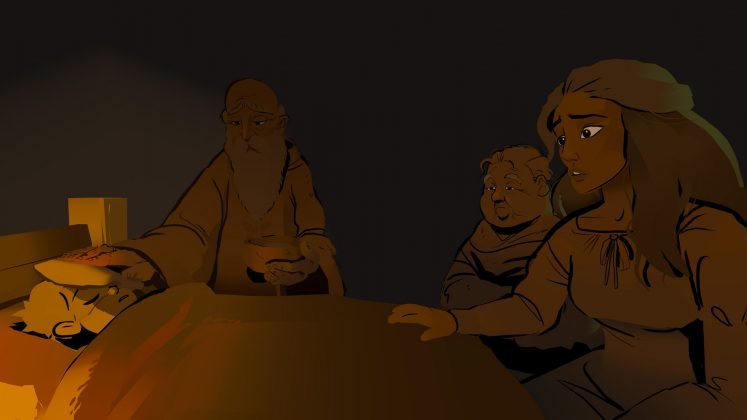
As I started writing the story, I focused on something simple with a minimal number of characters. Also, I knew I wanted exciting action scenes but before writing those I tried to make sure there’s an emotional connection with the main character and clear motivations for the heroine to go on an adventure.
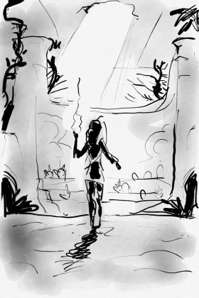
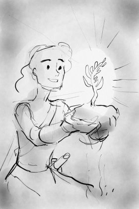
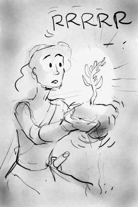
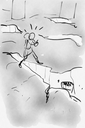
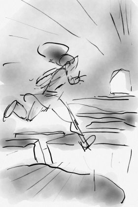
I did many different drafts of the script until I landed with something I was happy with and moved on to storyboarding. Some storyboards started as 2D sketches I did on my phone; the small screen allowed me to quickly put down any ideas I had for camera angles, scene staging etc. With these little scribbles as a reference, it was much easier later to do the VR sketching in Quill.
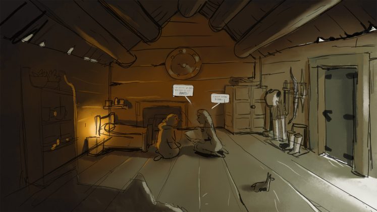
During this process it was important to start establishing the scale of the scenes in relation to the viewer, as well as the staging and planning for the ‘focal point’ of each scene to make sure that when there’s a ‘cut’ people don’t get lost or disoriented. I wanted the audience to be their own ‘cameraman’ in some scenes, like the one where the wagon leaves the house and you see the title. Planning all this with rough sketches was crucial, to make sure that some of the more experimental scenes would work before I jumped in and began modeling the assets.
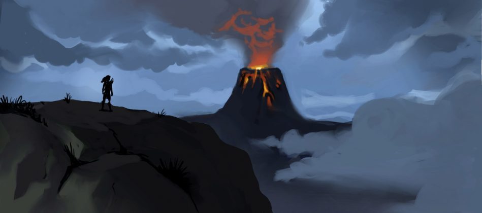
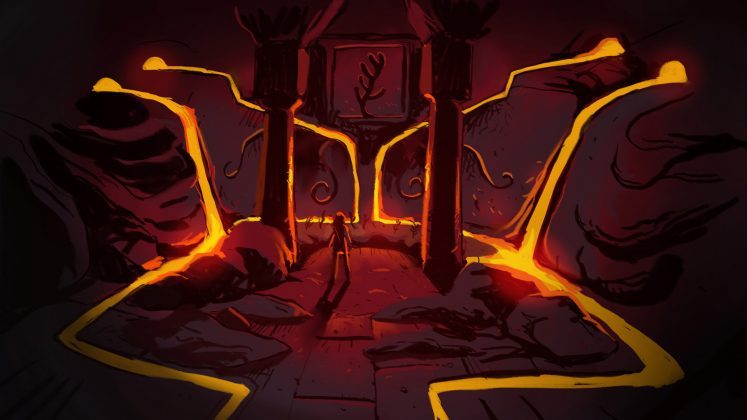
The transform keys in Quill allow you to create smooth animations and fade in and outs, setting a couple of keyframes on the group layers. This was super useful for adding ‘camera moves’ which I did by moving entire sets instead of moving the actual Quill camera. Like the ‘escape from the volcano’ scene where the character is on a static layer animated jumping from one platform to the other and the set moves toward the audience, giving the impression that the audience is moving forward.
The ‘stops’ (where viewer input is required to continue the story) were a new concept that we weren’t sure that would work, but I had the feeling that it would make it feel more like a comic book where viewers could take in the scene around them before continuing.
Picking where to put the stops was a natural choice in some cases, for example, the establishing shot where the heroine is in front of the volcano temple entrance. The audience might feel like spending a bit more time taking in the environment. Just like a double page in a comic book, it is a big featured moment, and you are invited to explore all the details until you’re ready to move on. In other cases the stops are helpful in case you want to spend more time reading the speech bubbles. And then in other cases I chose to not have any stop or pause, because I wanted the audience to feel the thrill of the action.
Once all the story scenes were sketched out I adjusted the timing and made sure I was happy with that because it was time to deliver the project to the audio and music team so they could get started.
The next step for me was cleaning up scene by scene and adding the color, details etc. For the key scenes I did a 2D color key sketch outside of VR. That was super helpful in order to establish a clear goal for the scene in terms of mood, color palette, and lighting.
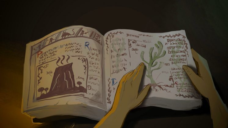
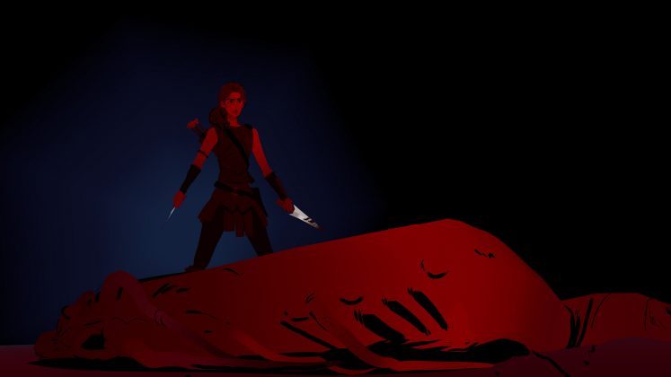
While most of the scenes in The Remedy are viewed from a third-person perspective, there were several scenes which I thought would be especially powerful in first-person. Thanks to VR, that perspective truly puts the audience in the shoes of the character. The ‘book’ scene—where the main character pages through an old book that sets up some important elements of the story—was important to me because being in a first person view it acts as a close-up shot, and the audience is welcome to lean in closer to explore the details of the book. In the ‘plant temple’ scene—where the main character finds the objective of her quest—I used first-person so that the audience could feel the same as the protagonist, admiring all the magical healing plants still growing on that orchard, and the sense of awe exploring how big is the temple. At the very end I included another first-person scene where I put the audience in the skin of the bad guy, looking up at the heroine as she holds onto the satchel—and his fate. Many of these shots would also work in 2D cinema, but in VR they become much more impactful!
When modelling assets I tried to keep an eye to the stroke count and the general density of the detail, since I knew there could be a chance for this project to run on Oculus Quest. Using the straight line tool as a base for most structures was the way to go. And also being smart about where to add detail and where to leave things more simplified. In most scenes there isn’t even a set or background, just the characters and a color gradient. This was completely intentional since I wanted the audience to focus on them and not be distracted by detail in the background.
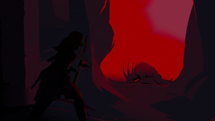
I knew that I wanted most of the animation to be simple from the start. I didn’t plan to do full animation for this project, but I realized the action scenes needed some extra detail to really sell them. The most complex animations were achieved with a rough sketch first, with the timing and most in-betweens drawn.
Then I posed the character by constructing it from separate, previously drawn parts. I grabbed each part, and using the rough anim as a guide, I positioned them on each frame.
This allows for a very traditional animation approach, and with the use of Grab tool I was able to duplicate and deform the pieces seamlessly. The animation also becomes layered or what was known as ‘limited’ animation in certain parts, meaning that I would divide the character and while some parts of the character are still moving other parts remain still, on a separate layer.
The whole team at Oculus became really excited to learn that The Remedy, would be playable on Quest! The Quill team lead engineer was able to squeeze the whole project into a small size, and he ran some extra optimizations to make sure it would play well.
The last stretch of work was very exciting because we started to hear the amazing musical score from Facebook’s sound designer coming to life. Due to the ‘stops’ feature, sound engineers had to come up with two types of scores: the first was timed with an average guess of the time it takes to read the speech bubbles and to progress through the story—that way if you wait for too long in a paused moment, the music continues and slowly fades into the atmosphere sound effect—the second type of score was for the more linear moments with a fixed timing.
As I was finishing the last scenes, sound design was catching up with me finishing up the music. The team did an incredible job with the sound effects that make everything feel much more grounded.
On December 1st I delivered the last scene and we added the credits and an intro page. And on December 20th The Remedy was publicly released on Oculus Quest!
This has been an amazing learning experience. I wore many hats and learned a lot in terms of storytelling, visual development, color, writing, and staging. But also huge learning in how to make the most out of Quill’s amazing toolset. I loved working on The Remedy and I cannot wait to create my next VR film with Quill!
Source: Read Full Article
 Guest Article by Daniel Martin Peixe