The original Nier was never a visually spectacular game, even for the console generation it occupied it paled in comparison to others in the genre. Textures were often muddy, while performance across both platforms failed to live up to expectations. It was a rocky experience, but the art and character designs shone through, proving so iconic in their uniqueness that even today, we look back upon them fondly.
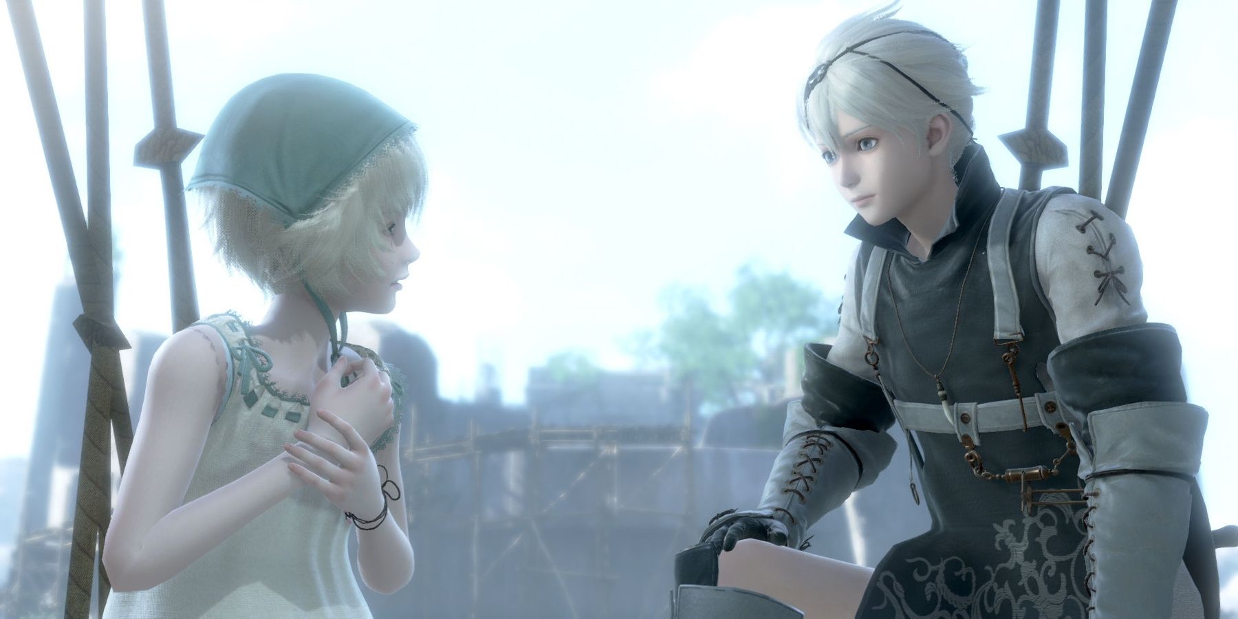
While Nier Replicant smooths out framerate troubles and other such annoyances, it rigidly abides by the visual identity that the 2010 classic helped introduce. It isn’t exactly an attractive game in the traditional sense. Colours are washed out and muted, representative of the sombre melancholy that underpins much of its apocalyptic world, with Nier, Kaine, and Emil discovering their own definition of worldly beauty as the narrative progresses.
Players aren’t expected to stop and stare at branching vistas and bright, saturated environments that take advantage of modern hardware. Turning Nier Replicant into Horizon Zero Dawn would dilute the JRPG of what makes its aesthetic so memorable. You’re meant to come to terms with your existence in a world almost robbed of life, with humanity clinging on to the decaying edges hoping to build something out of the wreckage.
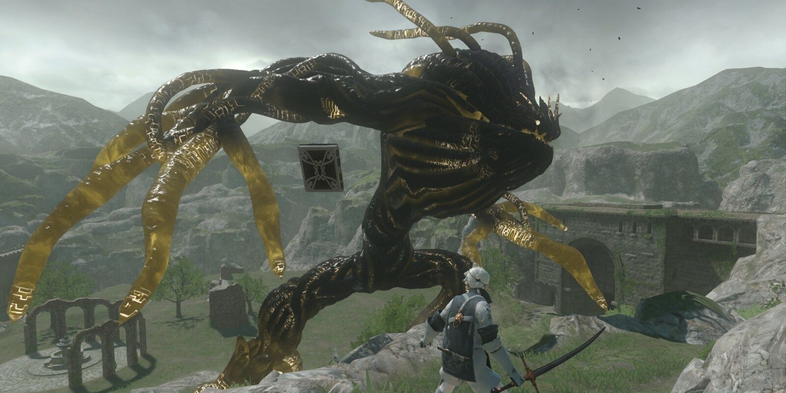
Brother Nier and his younger sister have created something out of nothing, even if illness and adversity have emerged as obstacles that must be overcome. The blood that bursts from your enemies is arguably the brightest example of colour in the entire game, largely because of the life it represents once the wider story rears its head. I won’t spoil anything specific here, but the nature behind the Shades is far deeper than one might expect, and for good reason.
Toylogic and Square Enix could have uprooted Nier from its origins and twisted Replicant into an unrecognisable blockbuster, one that overhauled not only the gameplay, but the graphics that fans have grown so accustomed to over the years. I’m glad they didn’t, since a full remake would risk losing so much of the homegrown charm Nier has and will always have. It feels like a project thrown together with a limited budget, with Yoko Taro and company doing everything they can to ensure the narrative shines above all else. They achieved this goal, even if mechanical frustrations aplenty surfaced in the finished product.
Whether you’re exploring your humble town, relaxing at Seafront, or venturing into ancient temples, Nier Replicant feels suitably subdued throughout in its overall presentation. Keichii Okabe’s orchestral score exemplifies the hopelessness of this world, yet imbues it with a sharp injection of optimism that permeates throughout the entire experience. You’re always holding onto the future, pushing forward in spite of the muted visuals opting you to remain in a state of perpetual misery.
Even if it’s a bit depressing, I wouldn’t have Nier remastered in any other way. Enhancing the combat, movement, and general flow of the game is all well and good, but morphing visuals into something that ventures too far from the original vision is a recipe for disaster. Fans would have been miffed, as would I, since a game like this should be remastered to appeal to a new audience without losing what made it so beloved in the first place. Toylogic achieved that, making this the definitive way to experience this story in 2021.
Next: Nier Replicant Complete Guide And Walkthrough
- TheGamer Originals
- Square Enix
- Nier Replicant
Jade King is one of the Features Editors for TheGamer. Previously Gaming Editor over at Trusted Reviews, she can be found talking about games, anime and retweeting Catradora fanart @KonaYMA6.
Source: Read Full Article


